StudyNest
Mobile App - Flashcards
Design Process
Competitive Analysis
- Anki Pro
- Pros:
- Allowed to pick cards from a library
- Optional interface change and app icon change
- Cons:
- Cards from the library aren't always reliable
- Too many options / no concrete brain identity
- Flashcards
- Pros:
- Share flashcards option
- Create my flashcards
- Cons:
- Too many ads
- Too many title names (deck name & cardhold name) are unnecessary
- Quizlet
- Pros:
- Follow someone else's flashcards
- Optional quizzes, courses, and expert solutions
- Cons:
- Not all already decks are credible
- Flashcard making limit on the basic plan
Define
User Personas
Ideate
User Flow
This user flow helps Sarah quickly set up a reminder, allowing her to stay consistent with her learning despite her busy schedule. By creating a personalized study schedule, she can build better habits and reduce the stress of last-minute cramming.
SiteMap
This sitemap visualizes the core structure of the StudyNest app. Providing users with a simple and organized navigation experience, helping users like Sarah efficiently access key features to support consistent and engaging study habits
Prototype
Paper Wireframes
High-Fidelity Prototype
Reflections
Next Steps
- My next focus will be on refining the UI of the prototype. I plan to complete the app by adding all remaining interactive buttons and screens for a fully functional flashcard experience.
I learned
- The importance of research and truly understanding who I'm designing for.
- There's a big difference between simply talking to users and designing with their needs in mind. The more I understand their pain points, the better I can create solutions that improve their experience.
- Usability testing requires multitasking - observing users, offering assistance when needed, and taking detailed notes.
Challenges faced
- Initially, I designed based on assumptions about user needs. Usability testing revealed that I needed to improve screen transitions for a smoother experience.
- After receiving feedback, I had to redesign some user flows and create additional screens I hadn't planned for, like the congratulatory screens.
- Testing was delayed due to scheduling around participants' availability, which required flexibility and patience.
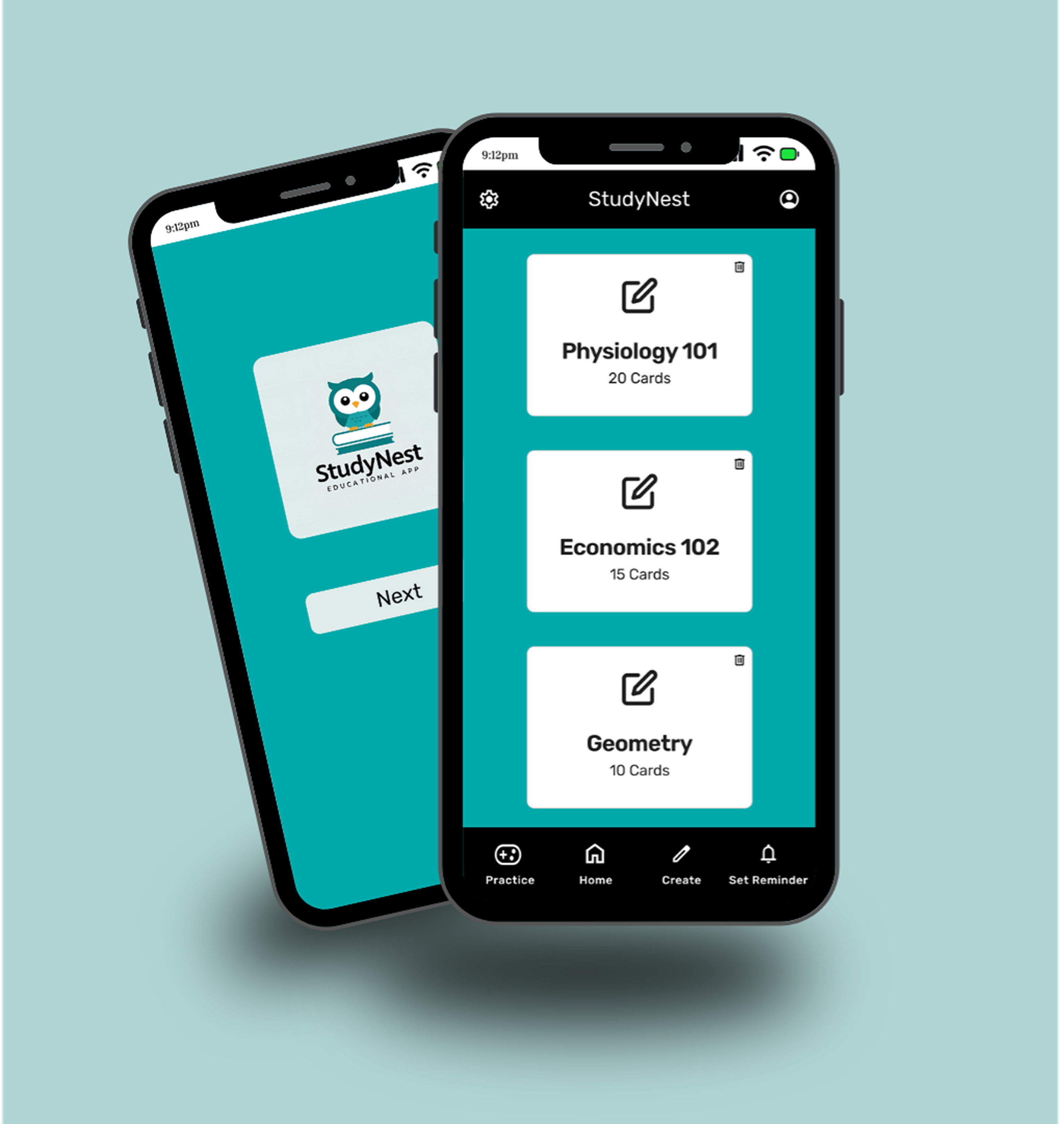
Style Guide
Color Palette
The mixture of teal and black as the primary colors of the app gives a perfect balance of calm and focus, making it ideal for a learning environment
- Teal was used for the background of all the screens
- Black was used for both the top and bottom navigation
Typography
- I decided on the typography of my app to be Rubik because it's clean, modern, and easy to read. Giving users a friendly and approachable feel.
Buttons
Icons
Images
Cards
Grids
Thank You
Read more of my case studies

