KeyField
Mobile App
Design Process
"I want to secure my family’s future. I’m ready to invest in property but need a smart tool that helps me find the right place fast!" Maya Bennett
Ideate
User Flows & Wireframes based on the User Story
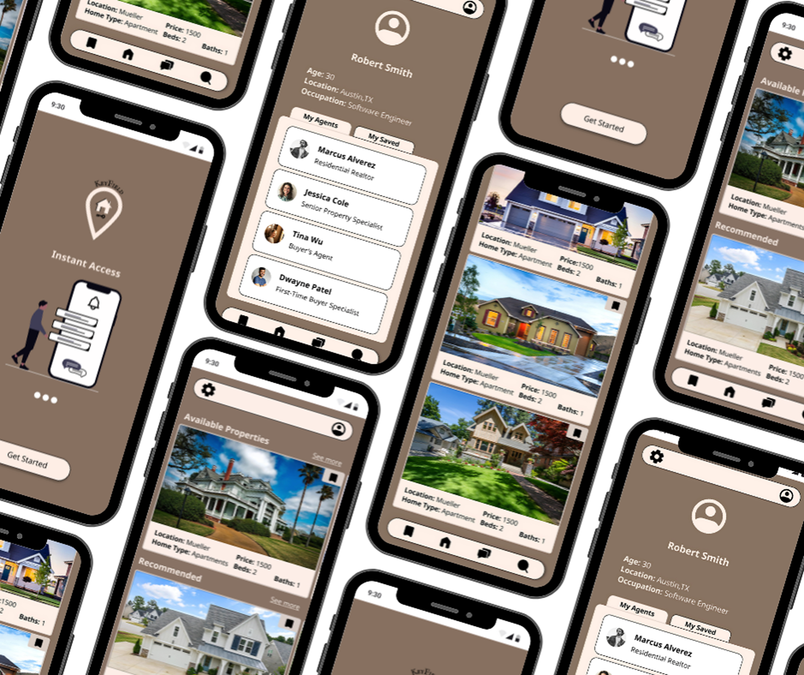
Design
Mid-Fidelity Digital Wireframes
Moodboard
I created multiple moodboards but landed on this one to define the visual identity of KeyField, I focused on creating something that reflected a sleek, modern, and luxurious look.
Refine
High-Fidelity Designs
Breakpoints
Landing Page
Final Designs

