Olive Health & Wellness
Mobile App
Overview
Problems
Through my research and personal experience, I discovered that many users like myself often jump from platform to platform searching for trustworthy health information and credible doctors.
- Users lacked access to trusted medical professionals, which prevented them from receiving accurate advice on care.
- Many people go years without detecting worsening conditions due to limited resources and fragmented health services.
- The absence of reliable information from verified sources can lead to poor health decisions and delayed treatment.
Solution
Users need a simple, centralized way to manage their health information and learn how to live healthier lives in one place.
Olive
A mobile app that:
- Provides secure and convenient access to personal health records
- Enables direct communication with trusted medical professionals
- Offers customized health guidance for overall well-being
Design Process
Empathize
User Research
Qualitative Research: I conducted interviews with 3 users to understand
- Perception towards virtual healthcare services
- Their needs and frustrations
Some Questions I asked:
- Are you currently using any virtual healthcare apps or websites?
- What feature do you mostly use, or what would you use?
- If you could add a feature to a health app, what would it be
- What features have you seen in apps that you don't use?
Insights:
- Users want personalized features such as live captioning
- App connects with other devices, such as their watch
- Social interaction features are seen as unnecessary and often ignored
Quantitative Research: I created an online survey to gather feedback from a broader audience, allowing me to understand trends and user preferences through measurable data.
Some Questions I asked:
- Have you ever used any Health and Wellness app? If so, which ones?
- Have you found this app effective in supporting your health goals?
- How often do you use this app?
- How do you typically track your health and wellness goals?
- What kinds of content would you find helpful?
Insights:
- 66.7 percent of participants use apps to track health and wellness goals
- My Fitness Pal and Apple Fitness were the most commonly mentioned apps
- 83.3 percent of participants have found the app to be effective
Competitive Analysis
Teladoc
Strengths
- The primary global leader in virtual care
- Efficient diagnosis and prescription access
Weakness
- A high number of complaints about poor customer service.
- Cancellation issues during emergencies
Walmart Virtual Health Care
Strengths
- Trusted brand reputation
- Affordable healthcare services
Weakness
- Financial sustainability concerns
- Operational challenges in managing retail and healthcare
Define
User Personas
User Journeys
User Flows
Ideate
Card Sort
With the help of UXtweaks, I was able to send out card sorts to 5 participants.
I learned that most participants categorized local doctors and virtual consultations into the same category as health professionals
Participants placed physical health and mental health categorized separate.
These results lead me to not have health professionals as a general option. Instead, give an option for health professionals or virtual consultations
Sitemap
Prototype
Paper wireframes & Digital wireframes
Low-Fidelity
Mid-Fidelity Prototype
High-Fidelity Prototype
Testing
6 Users were chosen for the remote usability test, which was conducted on Google Meet. The product was tested through Figma, with sessions taking from 10 - 15 minutes
Insights
Most of the users were satisfied but many showed to be hesitant on where to go or what things were. My UX writing was simple but not clear.
A participant mentioned the law of similarity and how the login and sign-up page should reflect what most users see on other apps. As mentioned, the typography and the color of the app should reflect a professional state for doctors. Those colors would be red, blue, or white.
It was noticed that most users were frustrated when returning to the homepage, which highlighted the need for a home button.
Olive went through a series of iterations, with the help of feedback from several participants and other designers.
This was crucial to the design process, as I was so focused on certain aspects, it caused me to miss small errors.
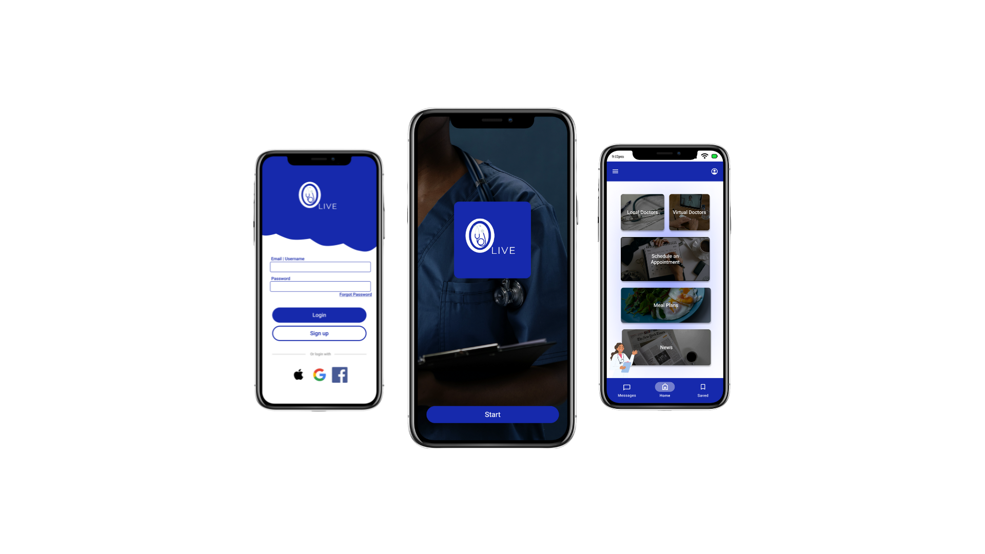
Final Designs
Reflections
- I've Learned that UX design isn't about what I think is best, it's entirely about how users interact with the product - my first set of prototypes I had thought was easy to understand, since I had created it. When I saw how users used it realized how unclear or unnecessary certain features were.
- If it's not usable for them, then it's not useful - In my first high-fidelity design, I thought everything was perfect. However, during usability testing, I quickly realized that the buttons were confusing and that I was missing a home button, something users needed.
- Feedback is a gift - My design was able to grow much more when it came to receiving thoughts and opinions from others, who could see things about the product that I had not seen.
Style Guide
Color Palette
- Blue is used for the navigation bars and buttons
- Black is mostly used for the background frame of titles on pages and text on cards, and articles
- White is used on the page and icon titles and background of cards
Typography
I decided on Montserrat for Olive because of its clean, modern, and easy to read on all screen sizes.
Buttons
Icons
Images
Cards
Grids
Thank You
Read more of my case studies

